PROJECTS / EXIT
EXIT is an algorithmically generated, immersive data narrative about global migration and its causes. It was competed in collaboration with Diller Scofidio + Renfro, Laura Kurgan, and Stewart Smith. The initial prompt for the piece was orchestrated by The Foundation Cartier in Paris, who organized a series of conversations between us and the philosopher, Paul Virilio. Additional consultations and feedback were provided by statistician, Mark Hansen, artist Ben Rubin, and anthropologist Bruce Albert. In response to these conversations we developed six data narratives that unfold over 45 minutes: Population Shift; Sending Money Home; Political Refugees; Environmental Refugees; Rising Seas, Sinking Cities; and, Speechless.
The piece was originally commissioned in 2008 for a show at the Foundation Cartier in Paris. A year later it traveled to Copenhagen as part of the UN climate change conference, COP15. In 2015, we were invited to rework the piece as part of the COP21 Paris Climate conference. Again, working in collaboration with Laura Kurgan and Diller Scofidio + Renfro, I created a complete revision of the piece, with new data and changes to the narrative. The graphics were also revised but were intentionally kept within the style of the 2008 piece to ensure a continuity in the piece’s lineage. EXIT 2015’s changes were significant enough to constitute a new piece that was purchased by the Foundation Cartier and made part of their permanent collection.
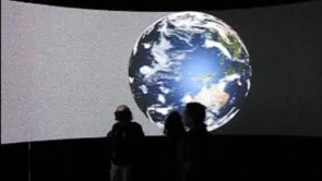
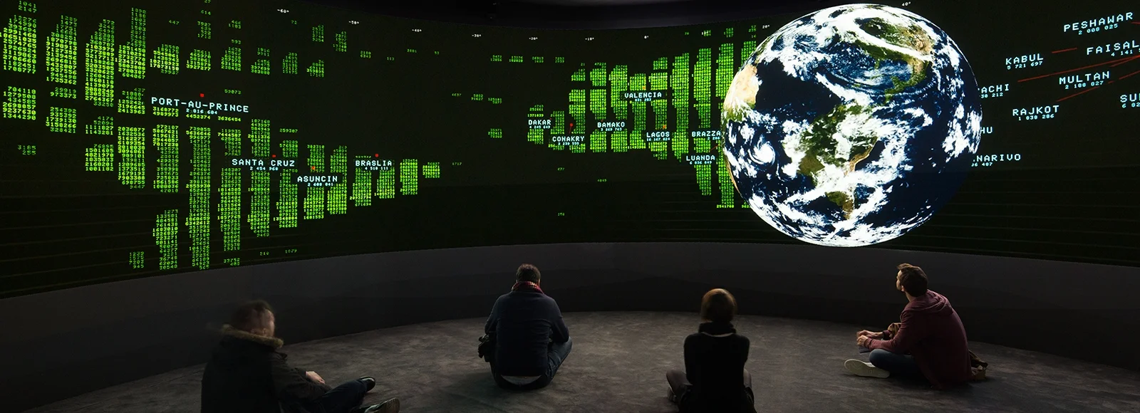
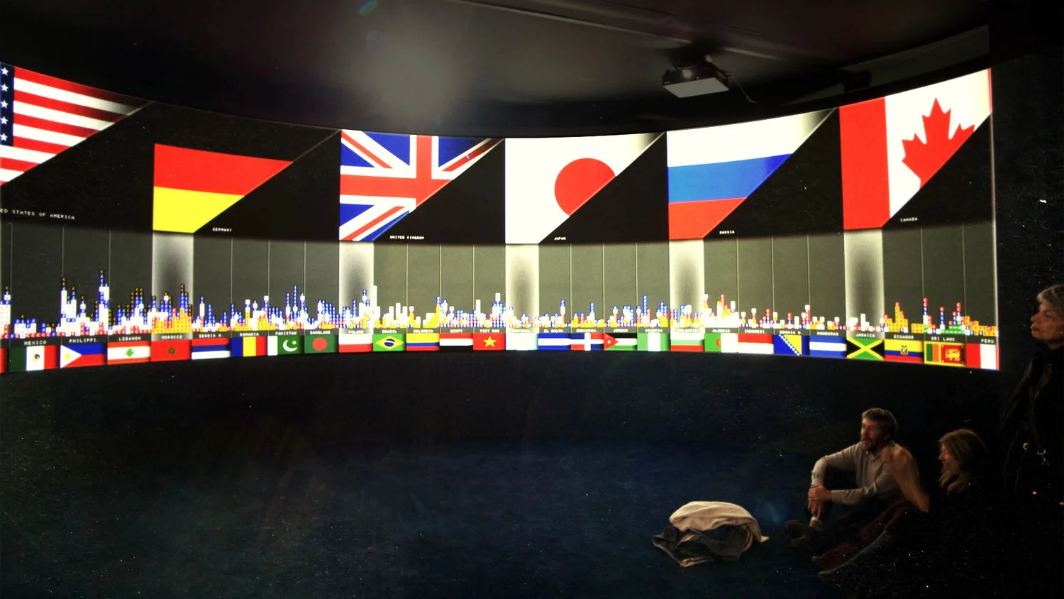
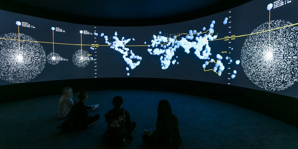
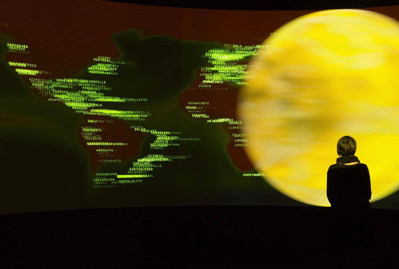
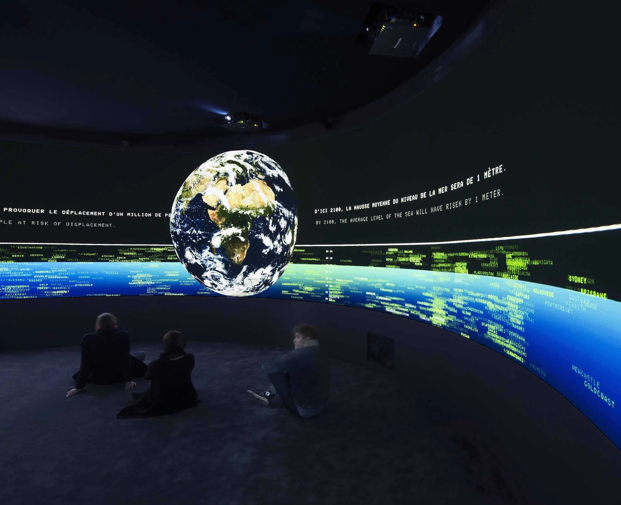
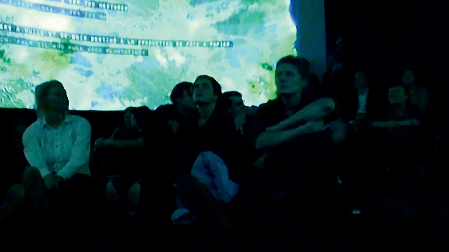
EXIT is displayed in a circular room, with thirteen foot tall video surfaces a circumference of 100 feet. Viewers are immersed in a 330 degree cartographic environment, where a large global playfully unrolls and prints layer upon layer of cartographic data, each adding complexity to the current narrative.
The dynamic graphics are the result of custom-designed visualization software developed by myself and Stewart Smith, named Bronson. We specifically designed the graphic techniques for each moment of the piece and the overall narrative arc, however the details of the graphics are algorithmically/statistically determined by the software as it processes its varying datasets. As a simple example, several parts of the pieces focus on a comparative analysis of numerous countries. Though the nature of the comparison is designed, the choice of the countries is not determined beforehand; it is computed by the software. Therefore, to update the datasets that EXIT relies on results in a new instance of the piece, with new surprises and insights within an overall familiar framework. It therefore balances narrative authorship with statistically generated content.
In its revised form, EXIT 2015 has traveled to six countries on four different continents.
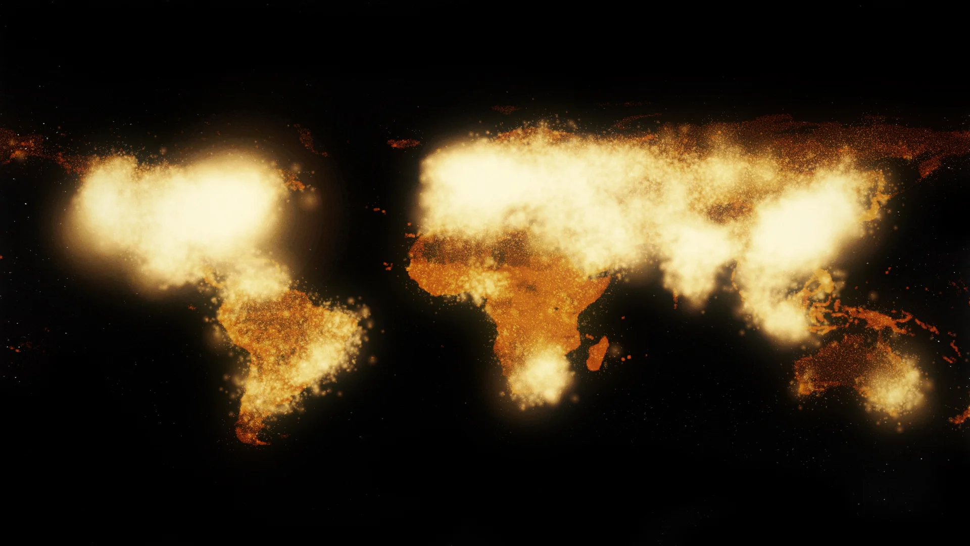
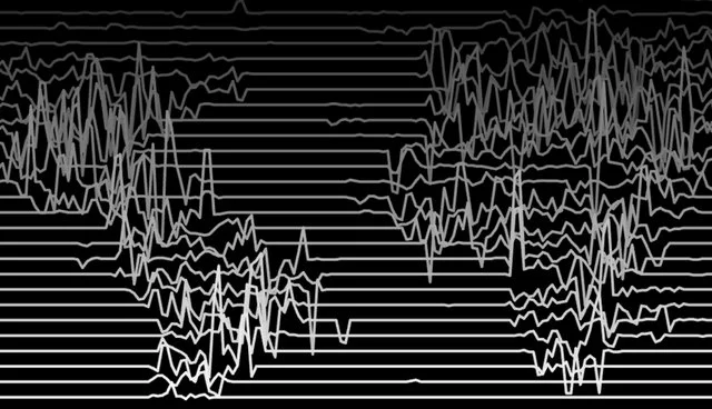
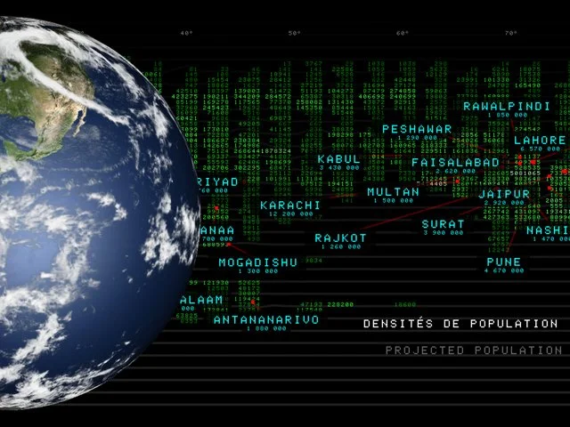
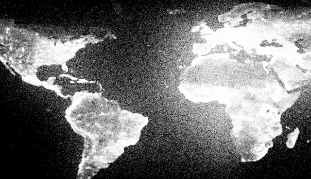
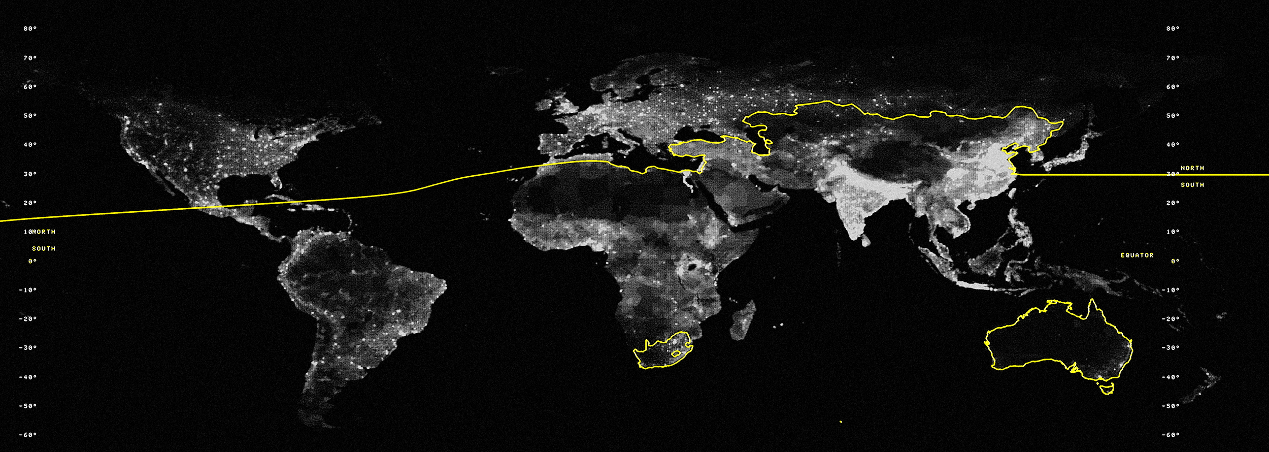
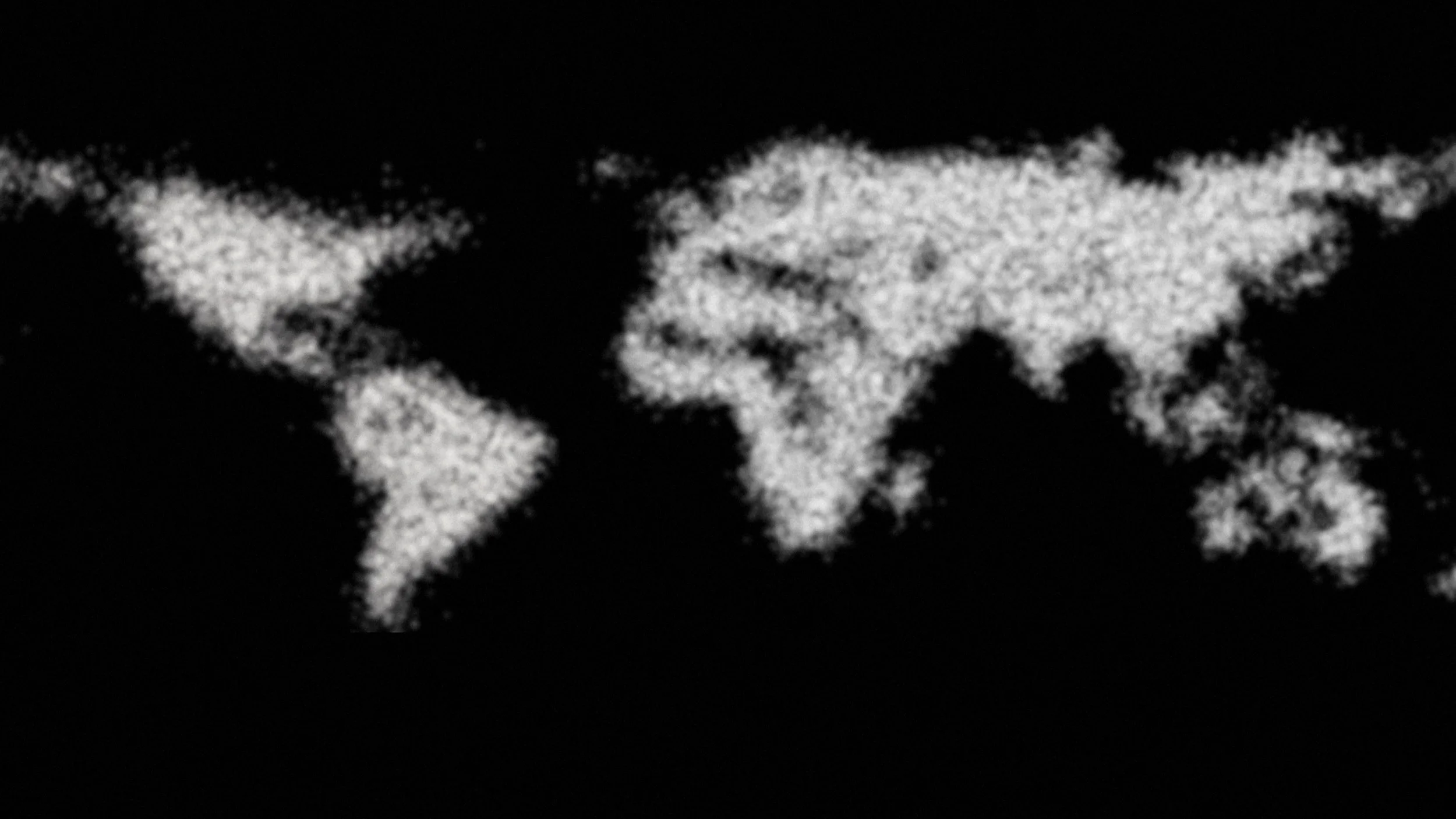
Population Shift shows a basic but compelling overview of where global population currently resides. It begins by filling the entire room with millions of evenly distributed pixels, each representing 1000 people. In two massive passes, pixels “flock” to their location on the map showing the overly-discussed distinction between “urban” and “rural” populations. (EXIT implicitly critiques this artificial divide by showing the persistent motion of peoples, as well as the numerous forces that affect the definition and fate of settlements). Next, a series of transects are cut through the population surface showing the changing terrain of agglomeration. Lastly, the room is filled with numerical counters, each geo-referenced. Across several decades the room “counts” up or down to the current population. Beyond seeing the changing counts themselves, the density of population is visualized by the number of significant digits at each location.
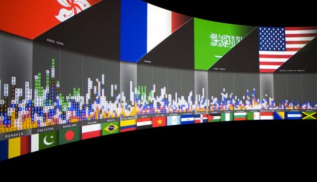
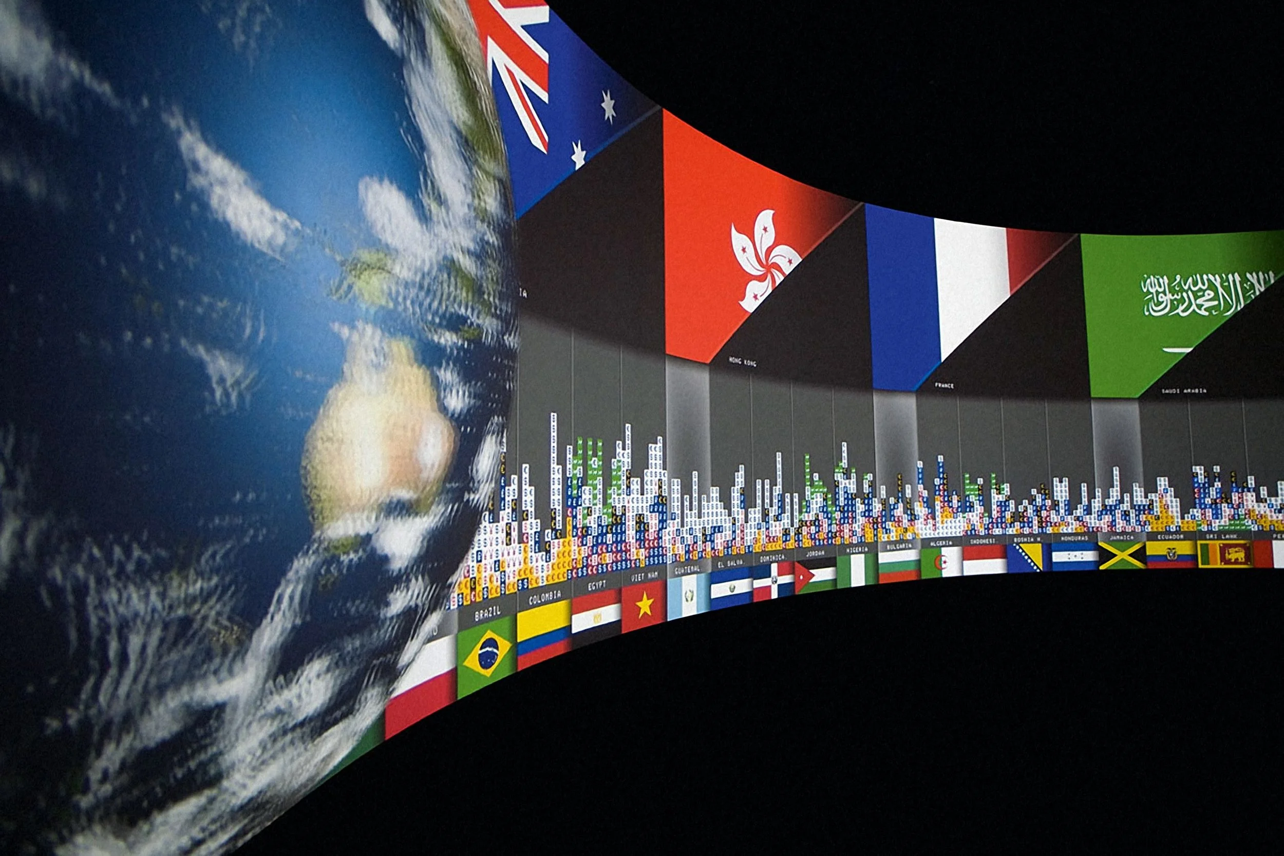
Sending Money Home explores economic migrants, or those people that move to more dominant economies for the purpose of sending money home to their families, known as Remittances. The space of this story is a comparison between national economics, the map is therefore composed with country flags, rather than depicting the physical forms of the countries itself. The software calculates the five countries that receive the most economic migrants, and for each of those, the ten most economically dependent countries. For each pair of sending and receiving countries the number of migrant laborers is calculated and depicted as is the amount of money sent back. The last view, ‘The Rotunda,’ uses the circular shape of the room to show an otherwise messy network of economic flows. The top 20 countries that receive migrate laborers, and the top 60 countries that send migrate laborers, are spread around the room on top and bottom of the wall, respectively. The room then rotates against itself so that each top country lines up with each bottom country over time, depositing money to that country. A viewer stand in front of a single remitting country, or follow a single receiving country around the room. The end result is a series of financial stratigraphic layers of remittances.
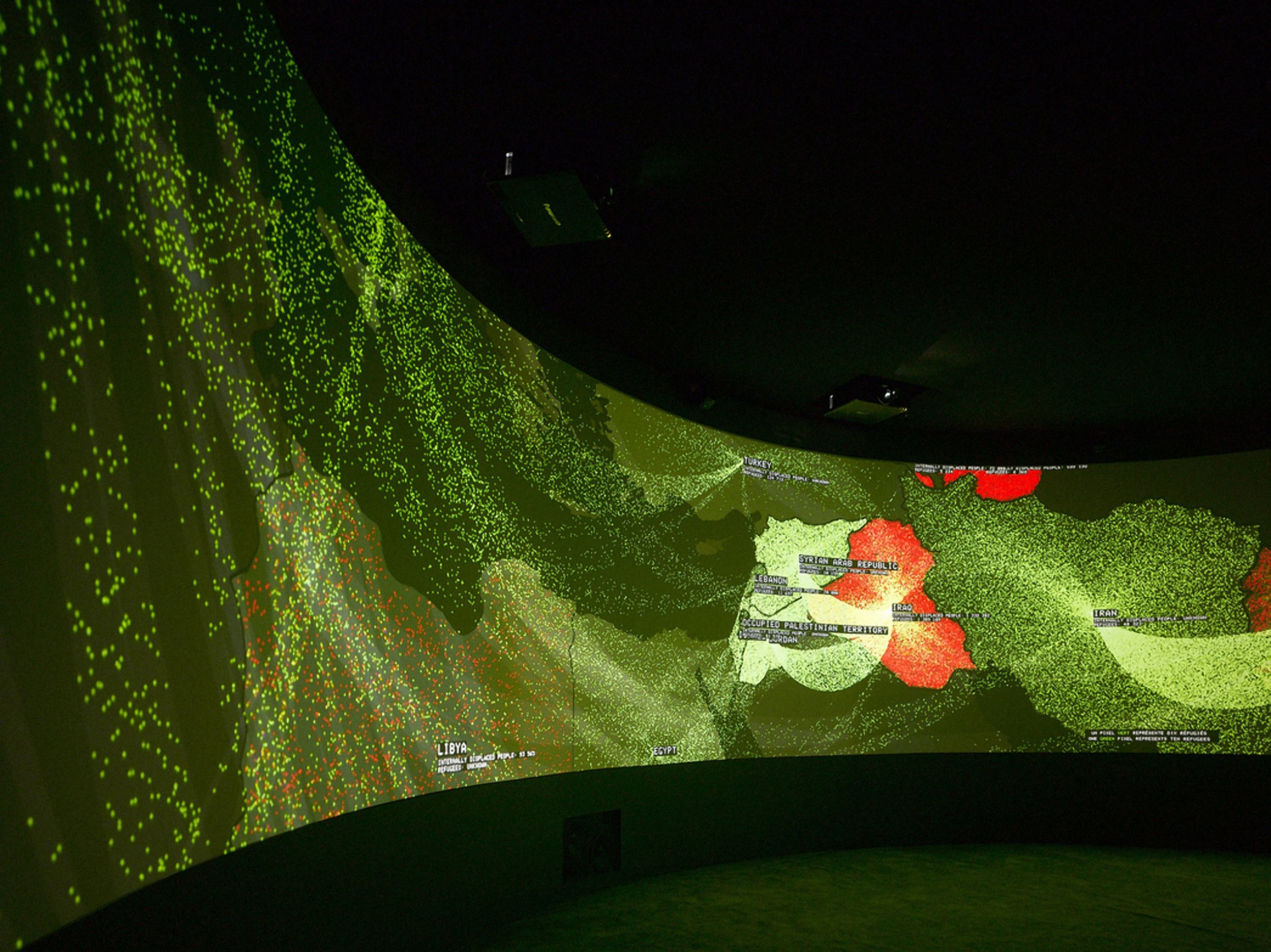
Political Refugees tracks sixteen years of global migration caused by political conflicts. Using data from the UN Refugee Agency, the full global network of migration flows are visualized. The graphics disaggregate the UN’s statistics to show the magnitude of the refugee crisis: every flowing green pixel represents 10 migrants. Every red pixel represents 10 internally displaced persons — people that are displaced by political conflicts but do not officially cross a national border. Beginning with a global view that abstracts annual migrant flows into a series of arcs, the scene quickly zooms in and immersive viewers in a wash of of flowing pixels. For each year, the software chooses the most dynamic refugee crisis and zooms / pans to that country. Therefore, any updates to the UN refugee statistics will create a new version of the scene that highlights new geopolitical conflicts. As expected, the 2015 data updates resulted in numerous zooms into Syria and Afghanistan.
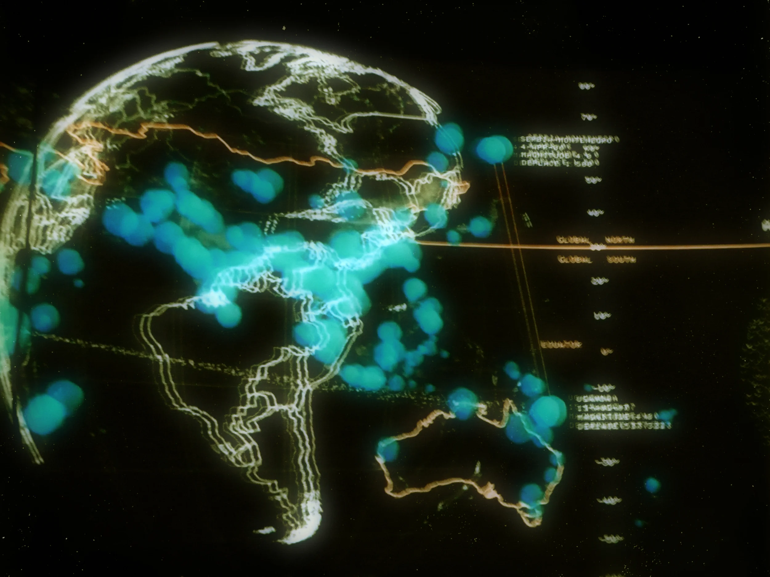
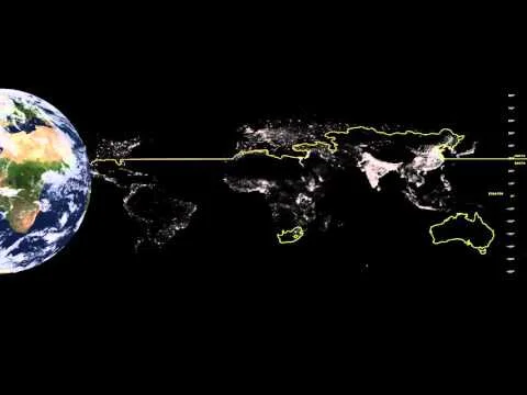
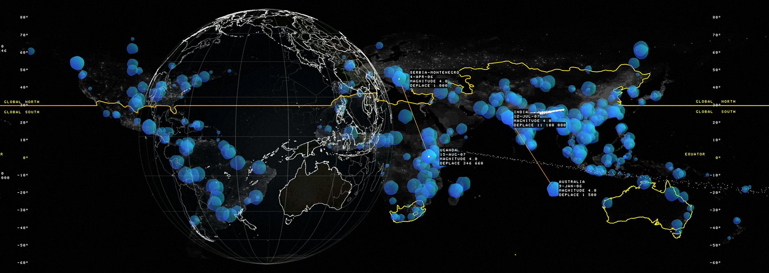
Environmental Refugees challenges the concept of a ‘natural disaster.’ It does so within the context of the Global North and the Global South. It uses this often-acknowledged dichotomy as a framework upon which to demonstrate our claim that natural disasters do not come from the environment alone but are attributable to other social, economic, and political forces.The Global North and Global South are first spatialized on the map by distorting the equator line The audience sees clearly that the designation of North or South is discontinuous; for example, the North includes countries such as Australia, New Zealand and South Africa. Then, sixteen years of global data is mapped with each flood categorized by its magnitude. The software algorithmically chooses a location in the North and the South that were subjected to floods of similar magnitudes, and that have similar population densities. Twelve of these are chosen for pairwise comparisons. Using another dataset that records the number of people displaced by global flood events, the scene highlights the vast discrepancy between countries in the North and the South, the latter being far more greatly affected. This comparison attempts to undermine the idea that flooding alone is the source of risk and the cause of disaster.
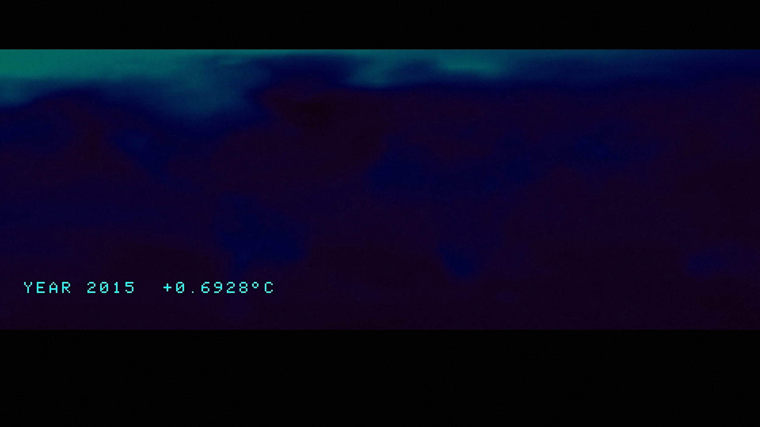
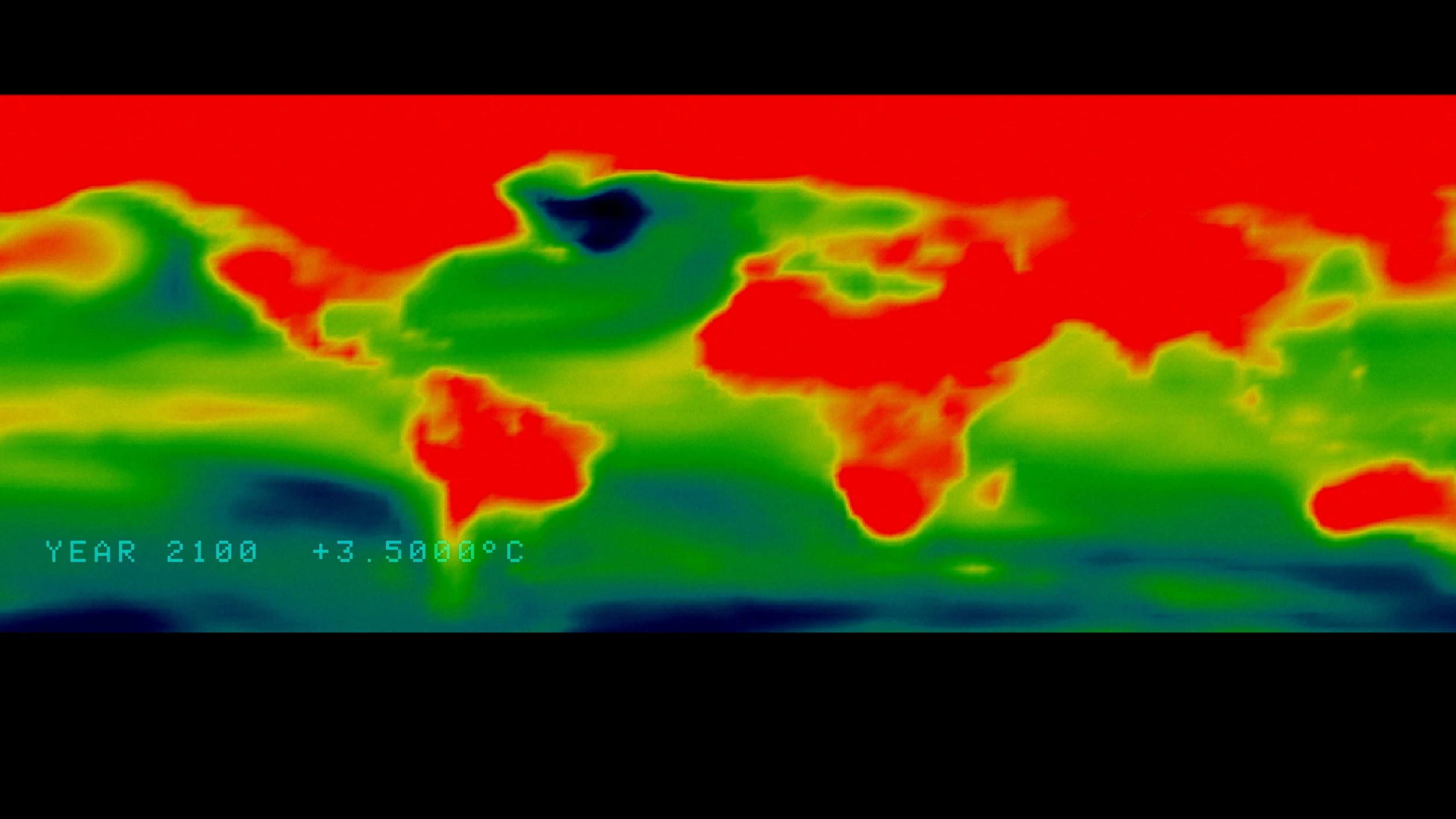
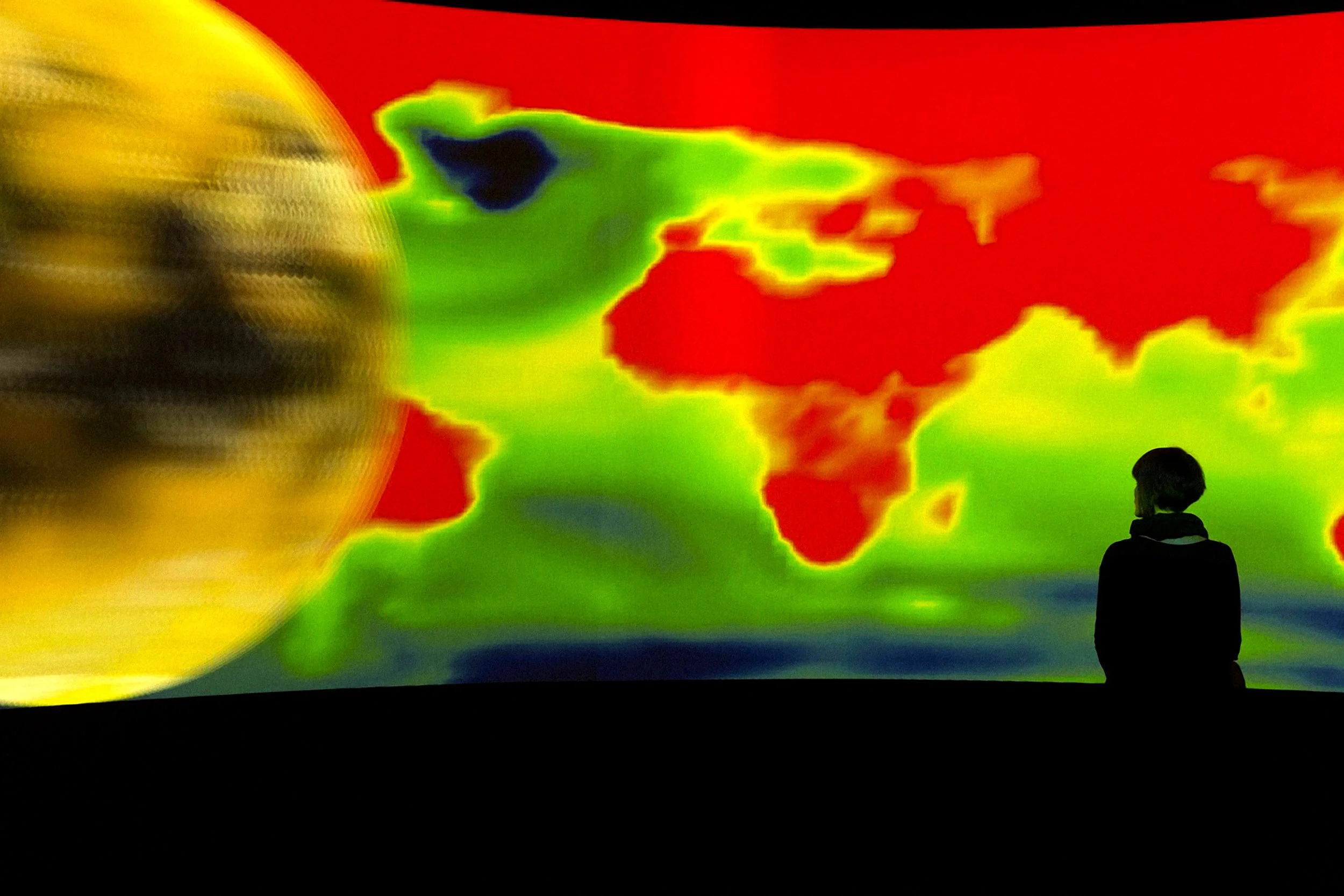
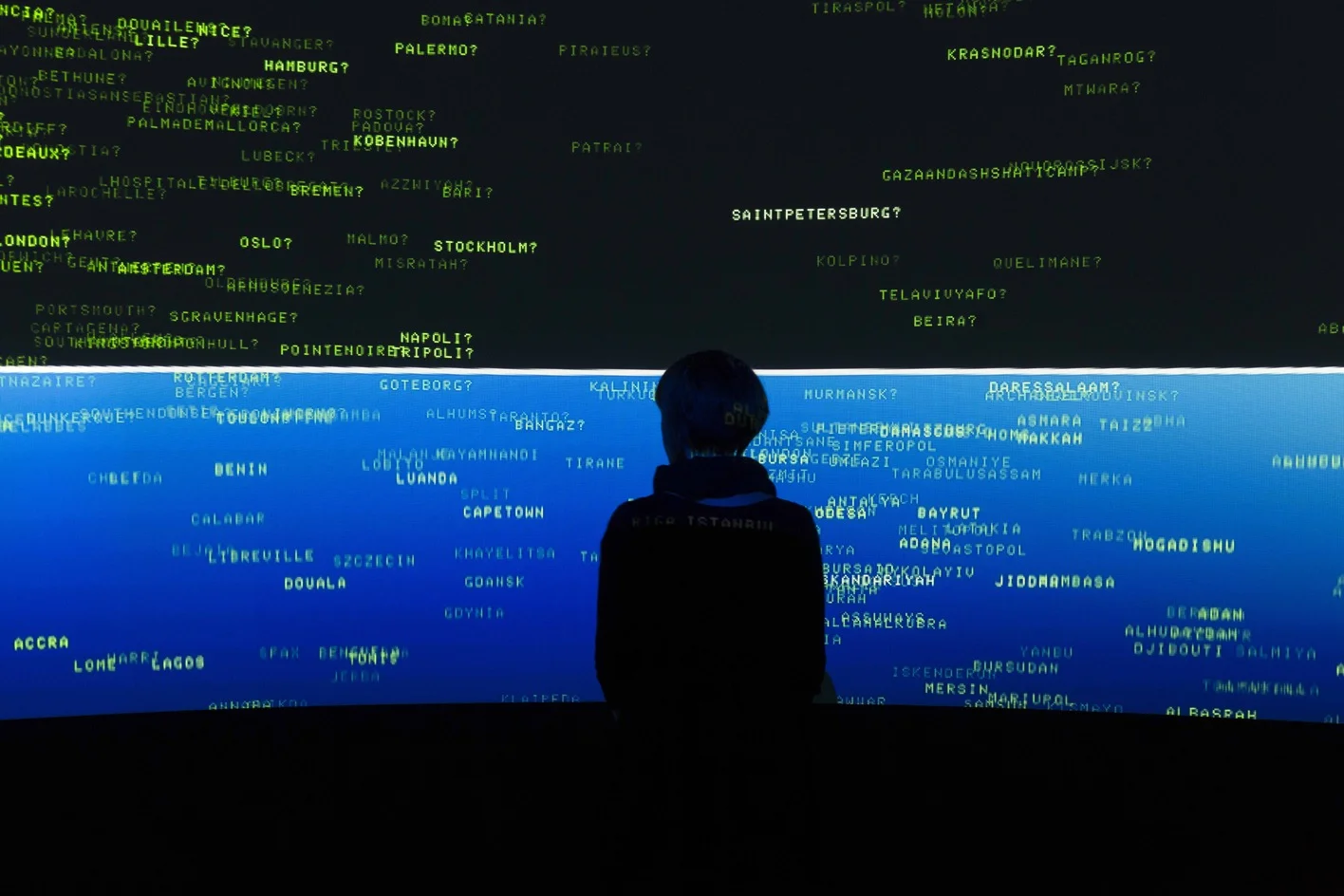
Rising Seas, Sinking Cities looks at the uneven spatial distribution of sources of Carbon, and the uneven spatial distribution of at risk populations from climate change. Global carbon emissions are first evenly distributed across population centers and then re-distribute to better reflect the locations with the most emissions. The effects of emissions on global temperatures are next explored showing the uneven distribution of temperature rise on the surface of the earth by visualizing, as a literal heat map, a +2 degrees celsius temperature rise. Lastly, the scene challenges the claims of geographic determinacy. All cities within 1km of a coastline is spread around the room. They are then moved to their official elevation at 1:1 scale. The room is then “flooded” with 1 meter of water to highlight which settlements would be underwater based on geography. A new metric of risk was developed for this piece was developed that ‘plucked’ cities out of the risk zone based on the state of their economy, levels of investment in infrastructure, and other socio-economic indicators. The settlements that remain submerged have an insufficient institutional or economic structure to protect them. This highlights the numerous other factors that more directly affect the distribution of climate change risk, and shows that the sources of carbon, are often not the same locations that must absorb the risk.
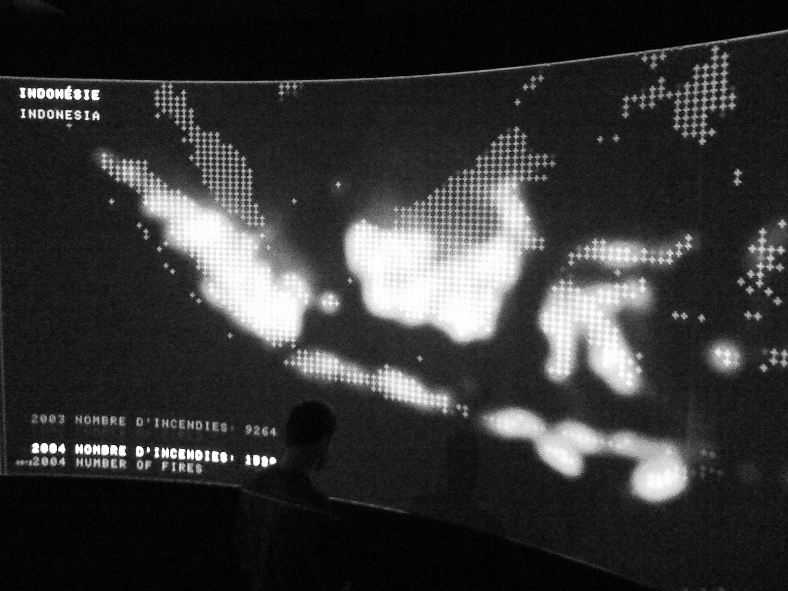
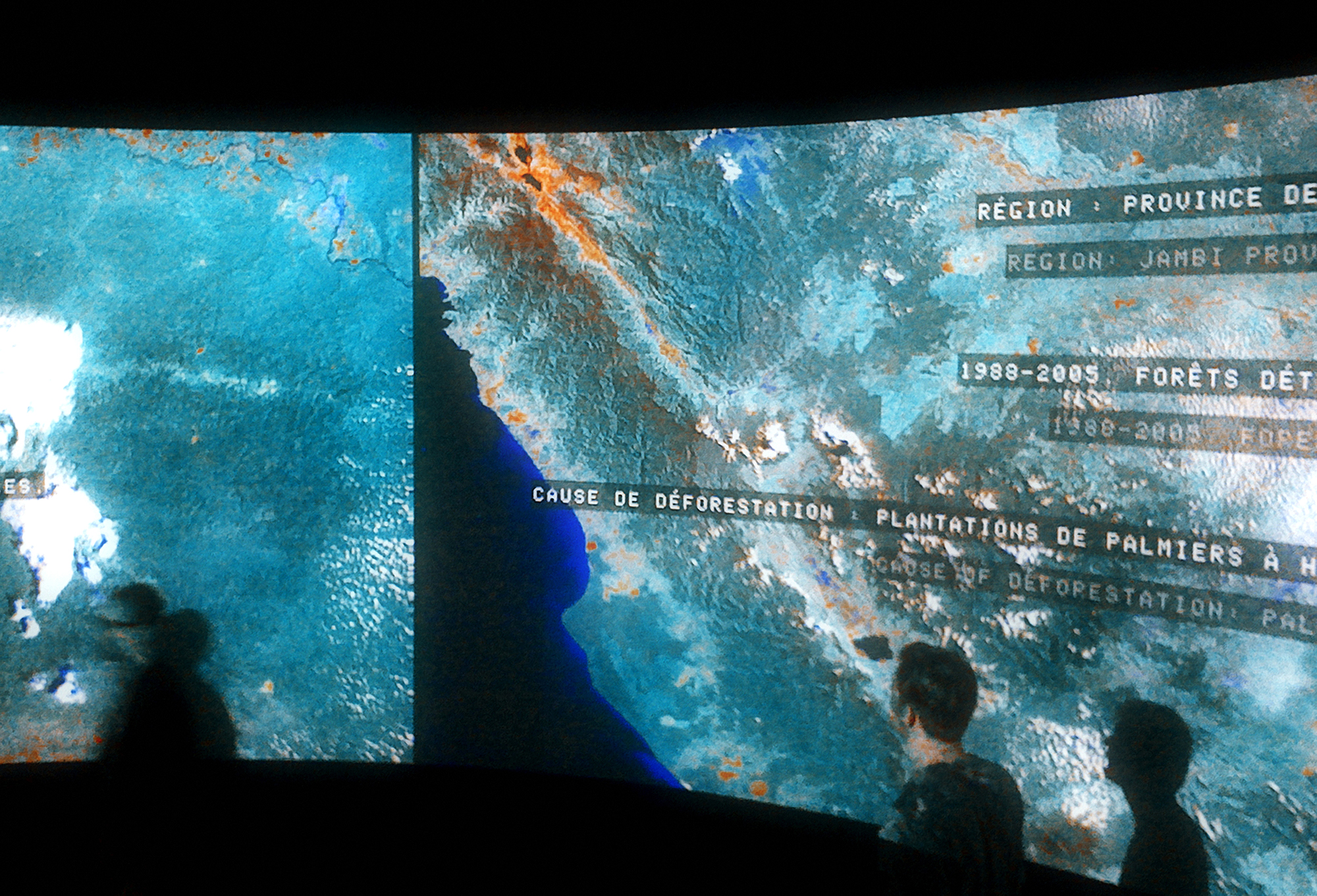
Speechless depicts the negative effects forestry and agricultural practices can have on indigenous populations and their cultures. Three example sites are compared with data and satellite imagery: Brazil, Indonesia, and Cameroon. First, the scene visualizes the amount of forest covered burned each year to clear ground for agriculture. The audience sees that it is widespread and aggressive phenomenon. At a more detailed scale, the scene visualizes the patterns of deforestation and the location of the illegal logging roads. Many of these directly affect the location of indigenous villages — forcing the communities to relocate or disappear entirely. To visualize these effects, the Speechless scene depicts a map of all endangered languages worldwide. It shows that many of them are currently endangered because of these forestry and agricultural practices. This research was conducted in collaboration with French anthropologist Bruce Albert who is an expert on Amazonian tribes.
[PROJECTS]
EXHIBITIONS
12.09.2019 - 10.11.2019
Nous les Arbres
Fondation Cartier pour l’art Contemporain
Paris, France
(single channel version)
25.05.2019-09.09.2019
Nature’s Nation: American Art and Environment
Crystal Bridges Museum of American Art
Brentonville, AR, USA
(single channel version)
02.02.2019-05.05.2019
Nature’s Nation: American Art and Environment
Peabody Essex Museum
Salem,MA, USA
(single channel version)
13.10.2018-06.01.2019
Nature’s Nation: American Art and Environment
Princeton University Art Museum
Princeton, NJ, USA
(single channel version)
26.10.2017 - 10.11.2017
XX Bienal De Arquitectura Y Urbanismo, Valparaiso, Chile
01.06.2017 - 27.08.2017
The World is Not Ours
La Kunsthalle Centre D’Art Contemporain. Mulhouse, France
(single channel version)
31.05.2017 - 15.08.2017
The Collection of the Fondation Cartier
Seoul Museum of Art. Seoul, Korea
22.04.2017 - 30.07.2017
Shanghai Project: Seeds of Time Shanghai Himalayas Museum. Shanghai, China
19.04.2017 - 13.07.2017
Art+Climate = Change
Ian Pattern Museum of Art. Melbourne, Australia.
07.01.2017 - 25.03.2017
The Sydney Festival UNSW Gallery. Sydney, Australia.
05.08.2016 - 15.10.2016
The World is Not Ours
Art Space Pythagorion. Samos, Greece
(single channel version)
24.11.2015 - 09.01.2016
COP21 UN Climate Change Summit
Palais De Tokyo
Paris, France
02.07.2015 - 28.11.2015
Big Bang Data
Espacio Fundación Telefónica
Buenos Aires, Argentina
(single channel version)
12.03.2015 - 24.05.2015
Big Bang Data
Espacio Fundación Telefónica
Madrid, Spain
(single channel version)
09.05.2015 - 16.11.2014
Big Bang Data
Centre De Cultura Contemporánia de Barcelona
Barcelona, Spain
(single channel version)
24.07.2011 - 07.11.2011
Talk To Me
The Museum of Modern Art
New York, USA
(single channel version)
18.05.2010 - 01.08.2010
Proyecto Tierra
Azkuna Zentroa | Alhondiga Bilbao
Bilbao, Spain
19.12.2009 - 21.02.2010
Native Land : stop eject
Kunsthal Charlottenborg
Copenhagen, Denmark
21.11.2008 - 15.03.2009
Terre Natale, Ailleur Commence Ici
Fondation Cartier pour l’art Contemporain
Paris, France
PUBLICATIONS FEATURING EXIT
Karl Kusserow + Alan C. Braddock, Nature’s Nation: American Art and Environment(Yale University Press, 2018)
Adrian Parr. Birth of a New Earth: The Radical Politics of Environmentalism (Columbia University Press, 2017)
Alan C. Braddock, “Ecology > Landscape” American Art 31 no.2 (Summer 2017): 59-61
Elizabeth Farrelly, “EXIT” Architecture Australia 106 no.2 (Mar|Apr 2017): 12-14
Benjamin Bratton, The Stack (MIT Press, 2016)
Pablo Lorenzo-Eiroa, Aaron Sprecher, Architecture in Formation: On the Nature of Information in Digital Architecture (Routledge, 2013)
Benjamin Bratton, “What We Do Is Secrete,” in Armitage, et al. (eds). Virilio and Visual Culture (Edinburgh University Press,2013)
Paola Antonelli, Talk To Me (The Museum of Modern Art, 2011)
